Ground Up Music
Timeline
December 2020-December 2021
Role
UX/UI Web Designer- Webflow
Goal
Build a website to feature Artist’s allow users to find out where purchase the songs
GroundUp Music is an independent record label founded in 2012. The label features a diverse roster of artists and focuses on music that defies categorization. The aim of the UX re-design was to improve the user experience for the label's website and online store.
Research
I conducted a content audit of the website to identify areas for improvement. Main goal was to reorganize the navigation, and improve the search functionality, and simplify the checkout process for the online store. I also evaluated the visual design of the site and made recommendations for improving the overall aesthetic.
This also involved conducting user interviews, surveys, and A/B testing.
Solutions
Homepage
The homepage should have a clean and minimalist design with a prominent header that includes the label's logo and a navigation menu. The homepage should display featured artists, albums, and events, and allow users to quickly access the latest news and updates.
Artist page
The artist page should showcase the artist's biography, discography, and videos. There should be options to purchase the artist's music and merchandise directly from the page
Music page
The music page should display the label's entire catalog of music, organized by artist and album. Each album should have a detailed description, tracklist, and option to listen to samplesEvents page
The events page should display upcoming concerts, tours, and festivals. Users should be able to purchase tickets directly from the page
Store page
Offer a selection of merchandise, including vinyl, CDs, t-shirts, and posters. Users should be able to browse and purchase items easily
About page
The about page should provide information about the label's history, mission, and team. There should be links to the label's social media pages and contact information for inquiries.

Visual Design
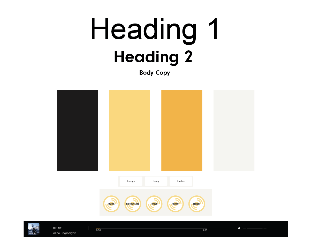
Overall, the design needed to be visually appealing, user-friendly, and intuitive to navigate. It was also optimized for mobile devices and incorporated responsive design principles. I used the yellow and black found in their logo and incorporated that in the design throughout the website.
